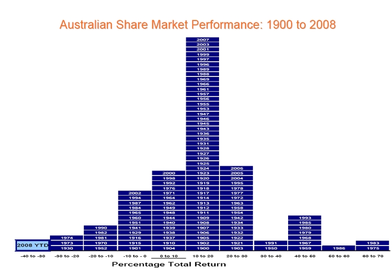
See notes below then click on graph to get a larger picture 
The graph shows the range of share market returns in every year from 1900 to 2008. Look at the worst years (ie. 1930, 1973, 1974, etc) & then find the following year. You will notice a dramatic increase after a poor year. This is the investment cycle at work. Getting a good, competitive return is not about timing the market, it's about time in the market.
9th-December-2008 |